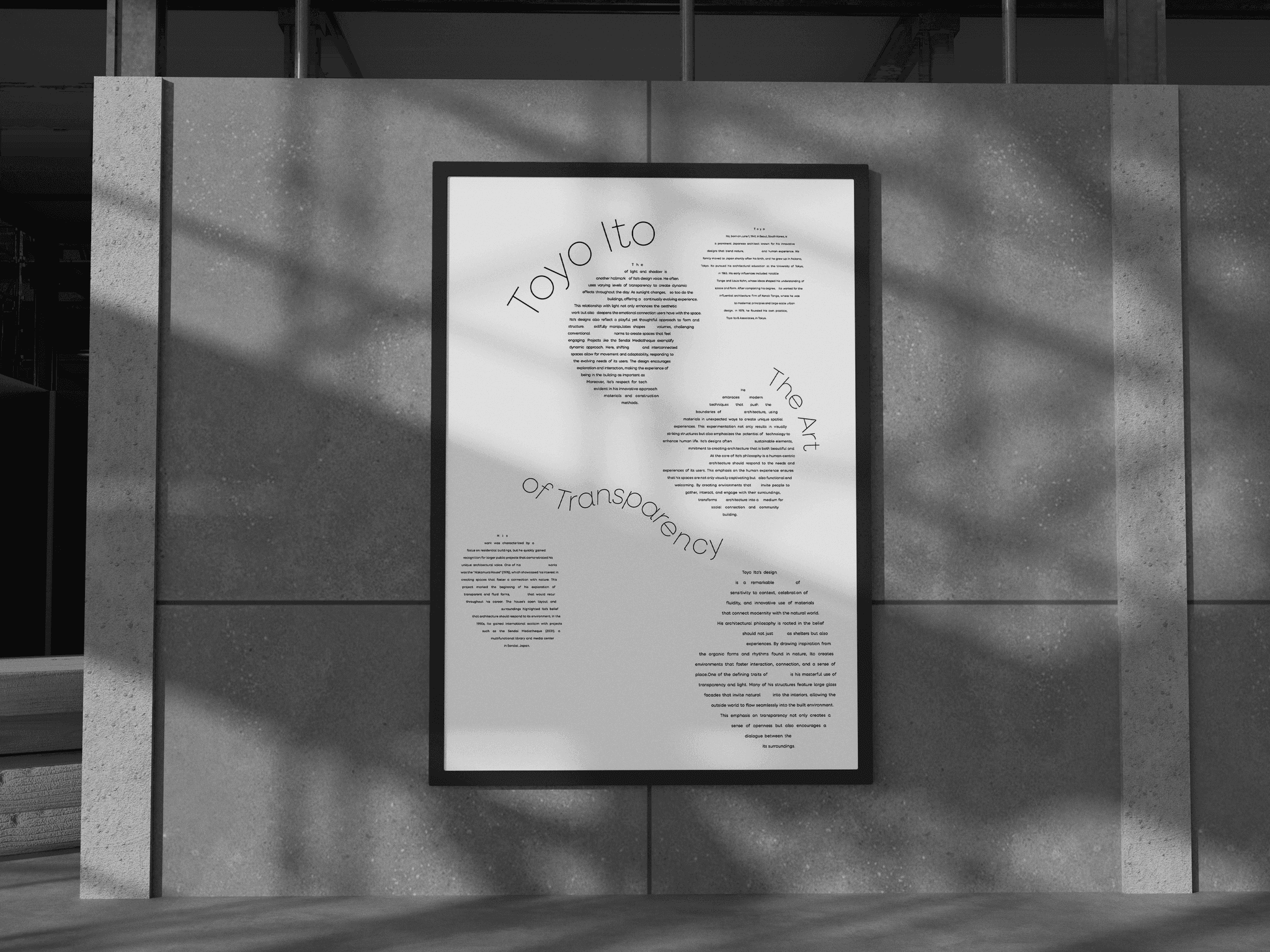
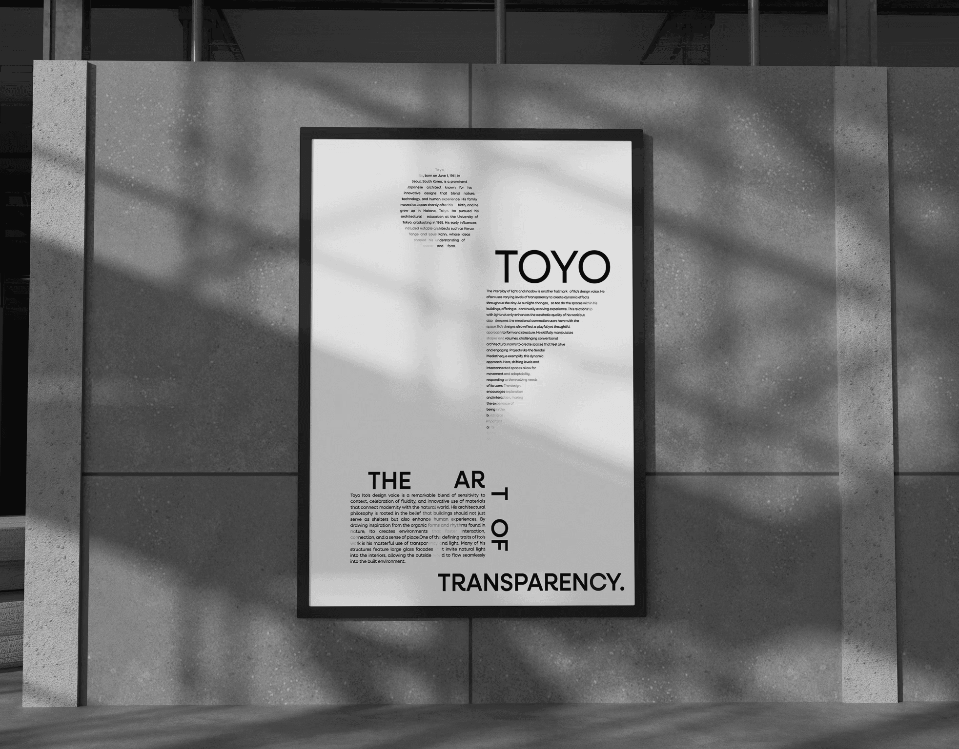
Architecture in Type
For this communication design project, I explored how typography can translate architectural principles into visual language. Focusing on the work of Japanese architect Toyo Ito, the goal was to create a connotative poster series that captures the conceptual and emotional qualities of his architecture. Using hierarchy, spacing, and form, the designs interpret ideas of transparency, openness, and spatial fluidity within a minimalist typographic framework.